15 Kitchen Makeover Ideas That’ll Make You Want to Redo Your Own
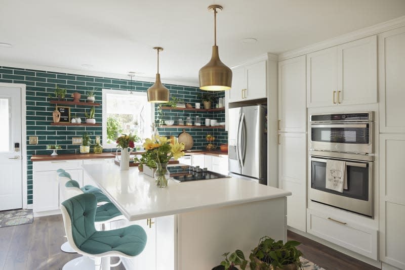
I dream of the day that I have a kitchen (and, let’s be honest, the funds) to renovate exactly the way I want. The cabinet color, fixture style, and flooring are all decided as of now, but there are so many other hypothetical decisions to make. As kitchen trends come and go, interior designers and homeowners have been taking more risks in recent years, and it’s clear that the kitchen isn’t strictly about function anymore — the possibilities for its style and design are truly endless.
We talked to kitchen experts and interior designers, and these are the hottest 15 kitchen remodeling ideas top of mind for the pros these days. Make sure to take notes, because you’ll want to try them in your space ASAP!
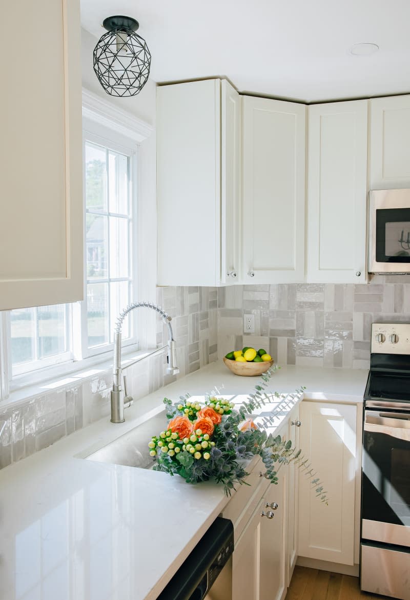
1. Use Tile as a Pattern
White subway tile is a classic, but it’s not your only option — explore creative tile layouts to infuse personality into your kitchen space. “Whether it’s a herringbone pattern or playful geometric design, a thoughtfully chosen tile layout adds character and visual interest to your kitchen, making it a focal point,” explains Meredith Huck, founder of Connecticut-based House of Huck.
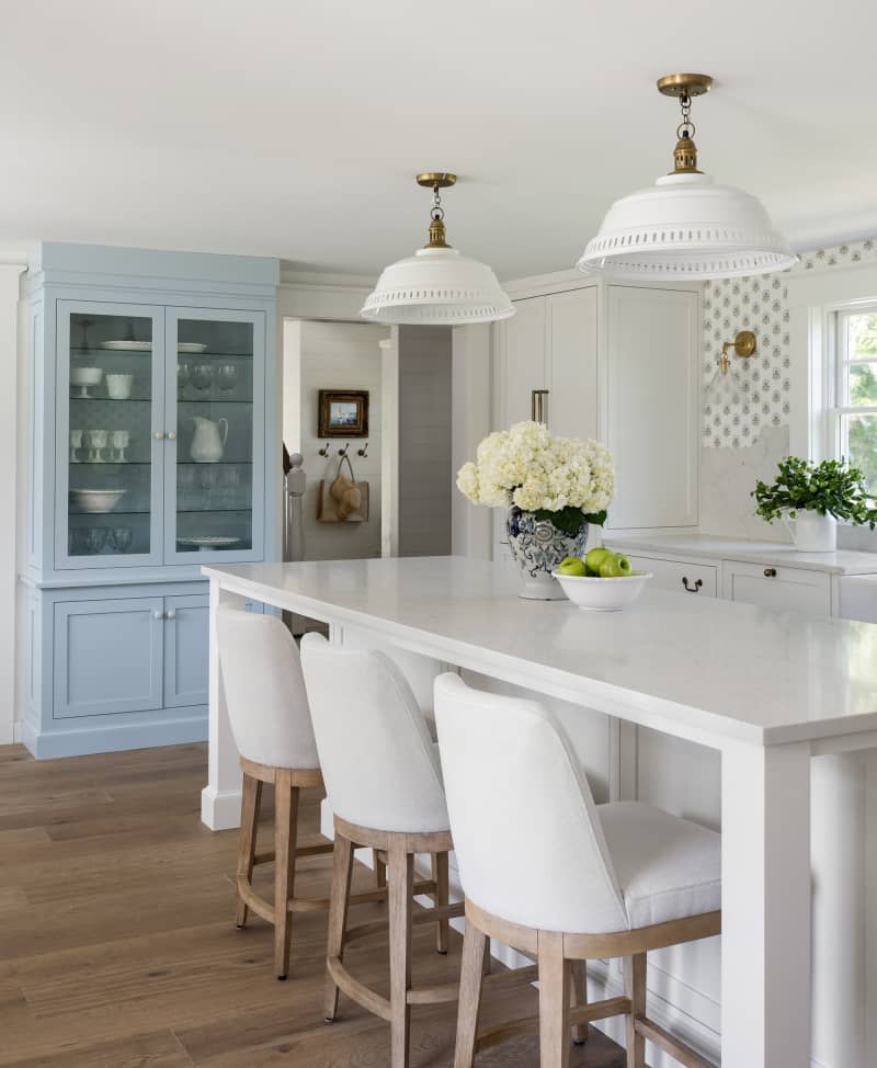
2. Blend It In
Colette Archambault and Karen Cacciatore, co-founders of Hunter Hill Interiors in Boston, Massachusetts, are big fans of the “un-kitchen” kitchen. “The space needs to function properly, but doesn’t need to feel like a kitchen,” they explain. “One way we approach this is by adding built-ins that look like furniture, as well as unexpected pops of color.” Wallpaper, a designated seating area (with stain-resistant fabric, of course), and lots of windows for natural light are other ways to achieve this homey vibe.
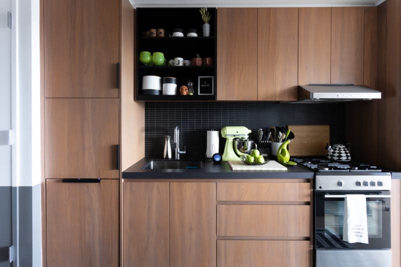
3. Select Seamless Hardware
When a lot of cabinetry is involved, Rachel Peck, founder of her namesake interior design firm in Austin, says push latch hardware will make the kitchen look less busy. Just one push is an all-access pass to anything you’re craving — no handles necessary.

4. Hang Curtains — But Not Where You Think
When faced with an expanse of cabinet doors, consider breaking them up with a softer storage option: charming, yet functional, cafe curtains. “The options are endless in customizing cafe curtains with a fabric to suit your space, whether it’s woven linen, a small print pattern, or a classic stripe,” says Kate Marker, founder of her namesake interior design firm in Barrington, Illinois. (FYI: My note about needing stain-resistant fabric is relevant here, too.)

5. Create Smart Storage Solutions
Nicole Pier, founder of her namesake design firm in Cleveland, emphasizes the importance of a thought-out plan for storage, “ensuring everything in your kitchen has a home.” For example, Archambault and Cacciatore begin the design process by asking the client for a full list of their everyday appliances and entertaining accessories. Peck advises floor-to-ceiling cabinets along an entire wall. Assigning one area to all the organization leaves more flexibility for the rest of the kitchen. Sliding glass door? Open shelving? A giant Nancy Meyers-esque island? The options are limitless.
6. Hide the Vent Hood
We’ve already established that kitchens are crowded by nature, and vent hoods contribute to this, but that doesn’t mean you should get rid of them. “I recently designed a kitchen with a pop-up vent behind the oven,” Peck says. “It allowed us to completely delete the overhead vent and keep the kitchen looking big and bright.”
7. Extend the Upper Cabinets
Another way to break up the monotony of cabinets is to extend some of the uppers all the way to the countertop, adding extra storage and continuity. For more interest, Huck recommends installing them on either side of the sink as a frame or using reeded glass on the door fronts for texture (or both!).
8. Layer on the Lighting
According to Pier, lighting can make a big impact on the mood of the space. That’s why you may want to incorporate a spectrum of options, such as cans, pendants, sconces, and under-cabinet. The vibes will always be immaculate, because you can control the ambiance with just your lights.

9. Incorporate Natural and Living Materials
The secret to a timeless kitchen, according to Bailey Ward, founder of her namesake interior design firm in Atlanta: natural and living materials such as marble and unlacquered brass. “Anything that is machine produced and man-made generally lends itself to what’s trendy at the time and will be outdated quickly,” she says.
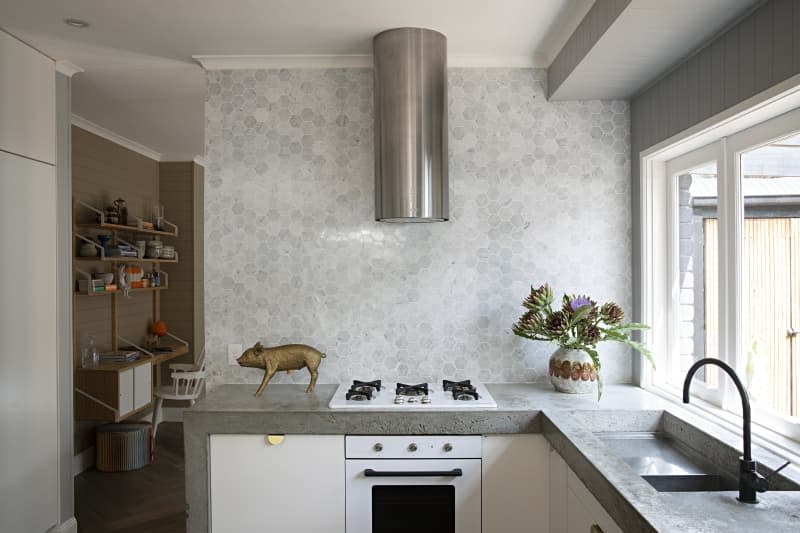
10. Trick the Eye with a Mitered Edge
A mitered edge is what happens when two edges are cut at 45 degrees and then together make a 90-degree angle, in this case creating the illusion that the entire countertop is actually much thicker than it is. “This thicker edge creates a sense of drama and imparts a high-end finish to the kitchen, all while being a cost-effective choice compared to some other premium countertop materials,” Huck explains.
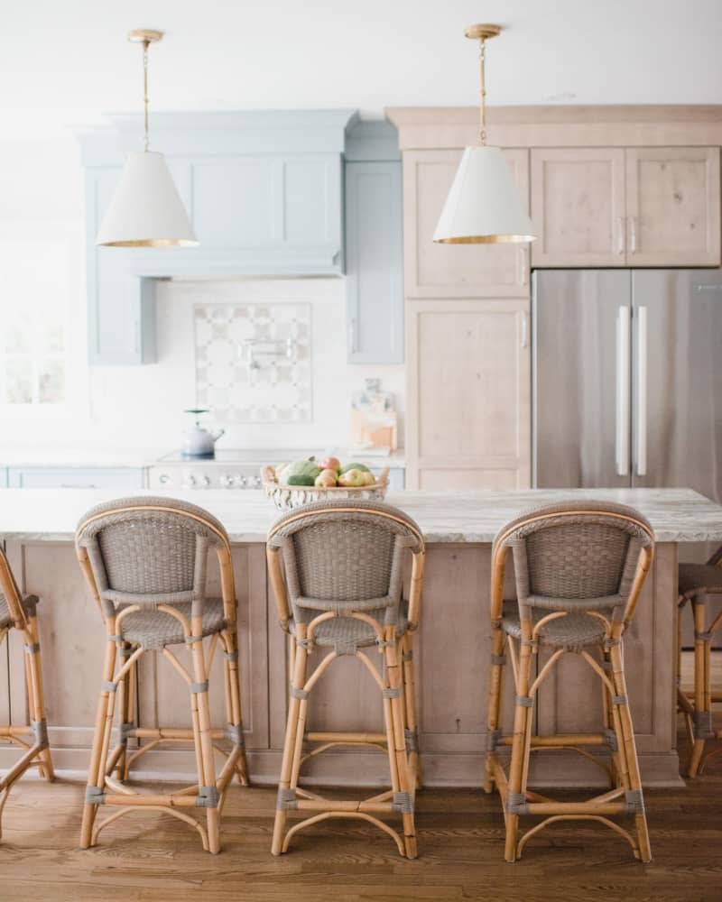
11. Install Wood and Paint Cabinets
Nowhere does it say that cabinets need to be finished one way or another, right? For a high-impact statement, Pier suggests incorporating both stained wood and paint. This could mean having one on the cabinets and the other on the island, dividing the two between upper and lower cabinets, or creating designated sections through the visual cue.

12. Get Creative with Color
If you’re designing an all-white (or equally neutral) kitchen, search for ways to break it up with color. “For example, painting the interior of glass front cabinets is a subtle way to add some color and personality into a kitchen while keeping a classic aesthetic,” she explains.
13. Add Paneling to the Island
“This subtle yet effective design choice not only enhances the island’s aesthetics, but also introduces texture and depth, making it a captivating focal point in your kitchen,” Huck says. Plus, the accent is relatively easy and inexpensive if you choose to DIY. Your island is already big — you might as well give them something to look at, you know?
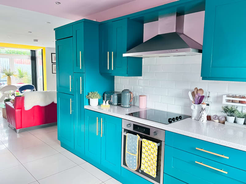
14. Mix, Don’t Match, Metals
“Not all your metals need to — or even should — match,” Ward says. She recommends pairs that have the same undertone (warm or cool), such as brass and polished nickel, oil rubbed bronze and copper, and polished chrome and matte black.
15. Just Move It
Just because a kitchen was built in a certain spot, Pier says, doesn’t mean it has to stay there — especially if it’s not working for you, whether that be because of minimal workable space or a lack of natural light. The kitchen is the heart of the home, and though it may sound drastic, moving it could be worth considering if it’ll make the room more functional and enjoyable for you and your loved ones.
