40 Trim Paint Colors That Will Add Interest To Any Room
From tried-and-true creamy whites and earthy tones to punchy blues and greens, paint your trim with these hues.
James Ransom; Styling: Alya Hameedi
It's easy to focus on the walls and overlook trim and molding when designing a room. Though it might seem like a minor detail, the right color trim can easily transform and help define a space whether it's highlighting key features, playing off colors already used within, or adding a bold accent without overwhelming the room.
Although many trim paints are predominately variations of white, we're all about venturing around the color wheel to create dimension and add interest whether it's in a punchy powder room, soothing bedroom, or elegant dining room. Whether you're looking for something bold and punchy or more neutral and understated, these 40 paint colors make your trim stand out. From traditional creamy whites, browns, and grays to blues, greens, and peachy tones that come in subtle and vibrant shades, there's a trim paint color to suit every style.
Related: Should You Paint The Walls Or Trim First? Experts Weigh In
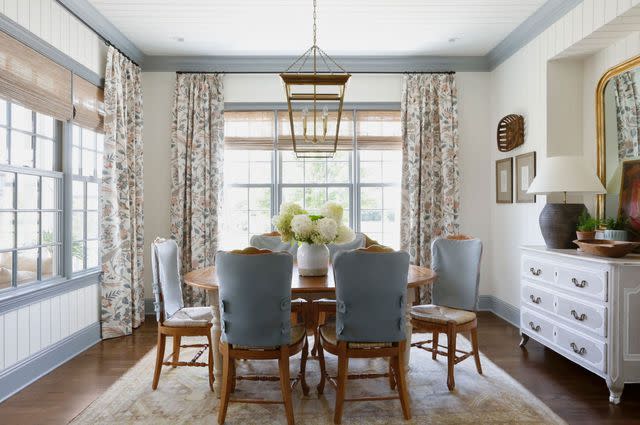
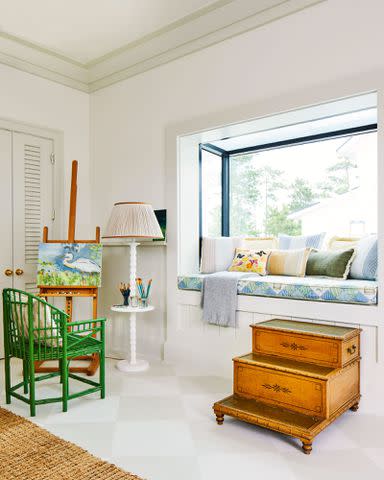
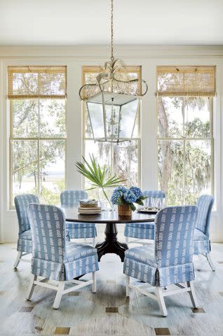
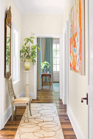
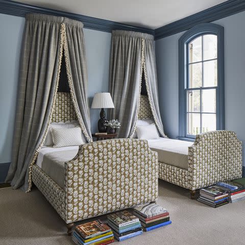
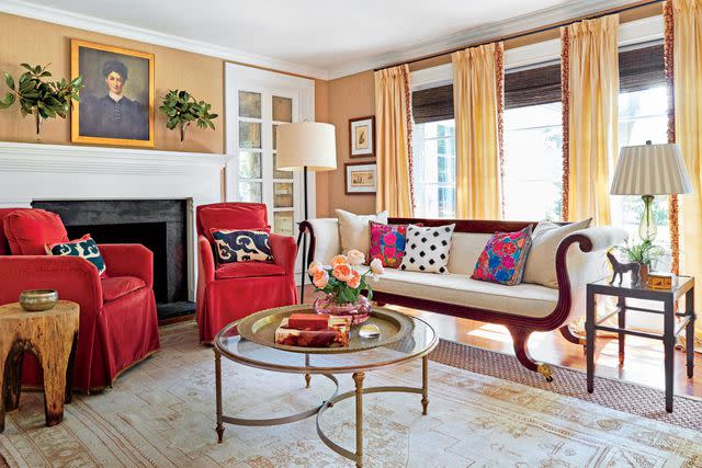
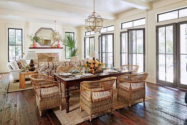
Sherwin-Williams Lullaby, SW 9136
JAMES RANSOM
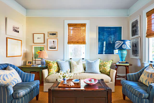
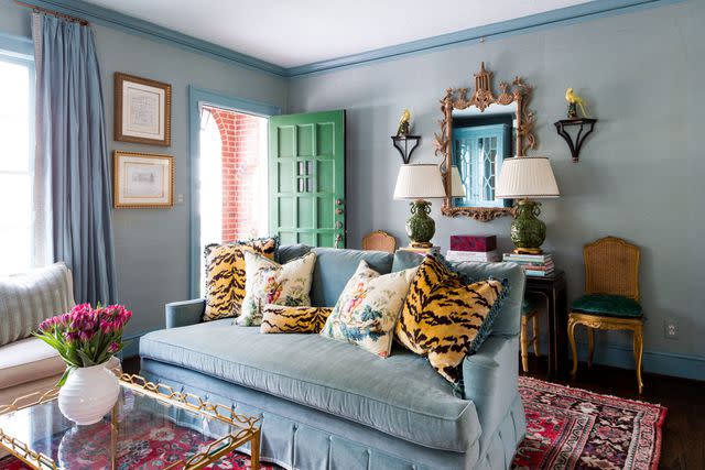
"When William and I started dating, we decided to buy a work of art together every year. It didn't have to be fancy, just something that we both loved," says Henderson.Rethink reaching for that creamy white paint and opt for a soothing blue that brings just enough color to a room while still feeling like a neutral. Treating her home like a canvas, artist Dorothy Shain Henderson played up the trim painted Sherwin-Williams' Lullaby (SW 9136) with various shades and textures throughout the living room. “I think of a painting a lot like a puzzle; you place color where it needs to go,” she says. “I believe my house is like that too.”
Related: This Century-Old Bungalow Is Full Of Playful Patterns And Happy Colors
Benjamin Moore Swiss Coffee (OC-45)
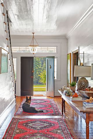
Alison Gootee
For an airiness that doesn't feel sterile, select Benjamin Moore’s Swiss Coffee (OC-45). "It's a warm, classic paint color that I love using in many projects," explains Anna Franklin, interior designer and founder of Stone House Collective. "Since it is an off-white, it goes with everything and provides a beautiful neutral palette to highlight the other textures and pops of color within a design." This farmhouse entryway is washed floor-to-ceiling with the popular color.
Related: This 19th-Century Farmhouse In Pickens, South Carolina, Is Almost Heaven
Farrow & Ball Cord, No. 16
Hector Manuel Sanchez
With earthy yellow, green, and brown undertones, this warm neutral complements just about any room whether it's paired with wallpaper or painted walls. For her son's nursery, designer Catherine Branstetter started with the wallpaper (Pierre Frey’s Bengali) then used Farrow & Ball’s Cord (No. 16) on the trim.
Related: Tour This 1920s Nashville Tudor Tailored For A Growing Family
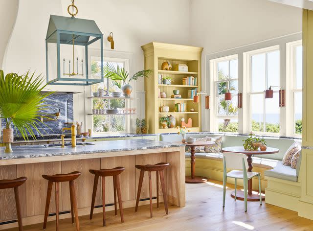
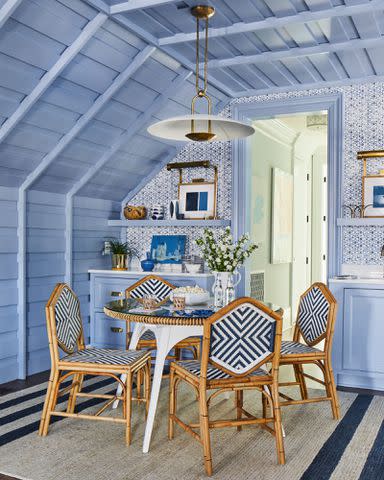
Sherwin-Williams Meander, SW 9522
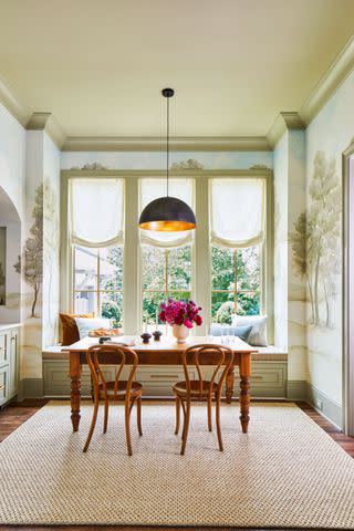
Laurey W. Glenn; Stylist: Matthew Gleason
For a warm tan with slightly green undertones, Sherwin-Williams' Meander (SW-9522) is the perfect color. In the 2023 Idea house, designer Laura Hodges used the natural shade on the ceiling and trim to compliment the tones in the wallpaper, tying the breakfast nook together.
Related: Idea House 2023: Step Inside Our Tennessee Country Home
Sherwin-Williams Extra White, SW 7006
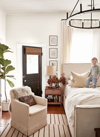
Brie Williams
Lean on your favorite white and cream paints for a comforting and clean slate. To keep it simple and reflect natural light, try Sherwin-Williams' Extra White (SW 7006) on the trim paired with Sherwin-Williams’ Pearly White (SW 7009) on the walls as seen in this primary bedroom.
Related: This North Carolina Home Is Like A Life-Size Treasure Box
Benjamin Moore Boca Raton Blue (711)
Opt for a trim color that's similar to your wallcovering, but not an exact match to create an inviting and refined space. In this entryway-meets-sitting room, designer Mallory Mathison Glenn paired Benjamin Moore's Boca Raton Blue (711) with a soft aqua grasscloth.
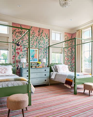
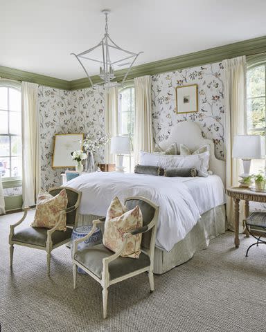
Sherwin-Williams Wool Skein, SW 6148
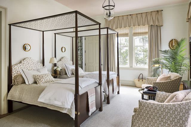
Choose an ever-so-slightly more saturated color like Sherwin-Williams' Wool Skein (SW 6148) for your trim. The deeper beige offsets warm neutral walls. In this twin bedroom, the designer chose to paint the ceiling in a soft peach, emphasizing golden undertones in the room's color palette.
Related: 2019 Idea House: A Charming New-Old Home Set On The Florida Coast
Farrow & Ball Green Blue, No. 84
Hector Manuel Sanchez
This minty fresh hue will brighten up any room. Depending on the light, the appearance of Farrow & Ball’s Green Blue (No. 84) can shift like a chameleon, favoring green or blue making it the ultimate pairing for an array of spaces and wallcoverings.
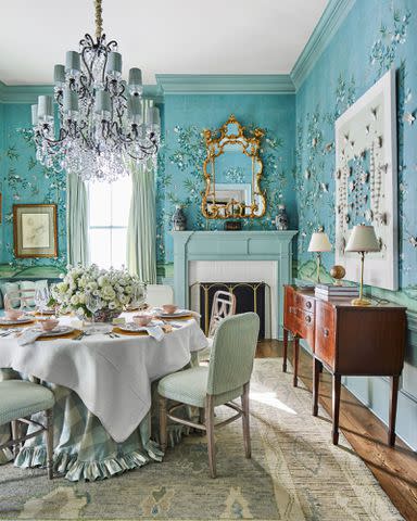
Benjamin Moore Garden Cucumber (644)
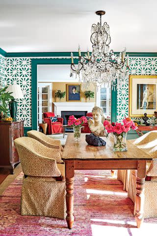
Give the heart of the home a dramatic, yet elevated flair with deep green trim. Designer Alaina Ralph paired a bright white wallpaper with Benjamin Moore's Garden Cucumber (644) to make a statement in this dining room.
Related: Bold, Bright Colors Transformed This James Island, South Carolina Ranch
Sherwin-Williams Cotton, SW 9581
Lighten up dark walls with a classic white like Sherwin-Williams' Cotton (SW 9581) while still evoking a sense of comfort. Designer Sarah Bartholomew even used it for the stencil detail just below the trim in the 2021 Idea House. "This is where an adult could sneak away to work, or it could double as a place to hang out with friends over a glass of bourbon," says Sarah of the library wrapped in a woven wallcovering by Phillip Jeffries (Manila Hemp in Truffle Brown).
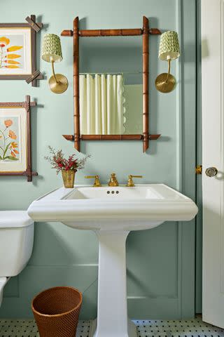
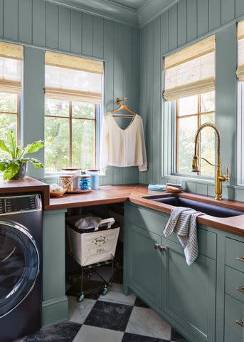
Sherwin-Williams Spinach White, SW 6434
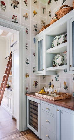
Add depth to small spaces with a trim color that is a departure from white, but still serves as a neutral. The subtle green-blue hue creates a seamless transition between rooms. Here, Sherwin-Williams' Spinach White (SW-6434) on the trim and cabinetry takes the butler's pantry up a notch.
Related: A New Tennessee Build Filled With Old Southern Charm
Benjamin Moore Boothbay Gray (HC-165)
For a soothing space, paint the accent millwork Benjamin Moore's Boothbay Gray (HC-165). "For those looking to make a more subtle statement, consider going white on the walls rather than the trim. The result is a room with bolstered charm and character," says designer Ashley Gilbreath.
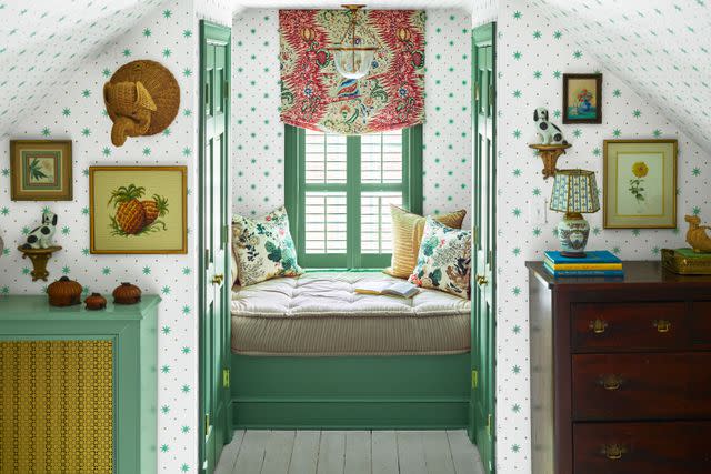
Farrow & Ball Pink Ground, No. 202
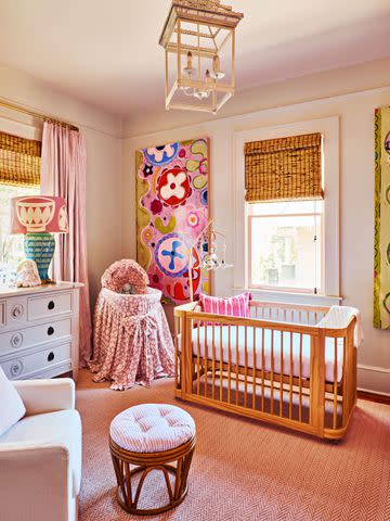
JAMES RANSOM; STYLING: Veronica Olson
While every inch of wall, trim, and ceiling in this nursery is splashed with Farrow & Ball's Pink Ground (No. 202), it's a perfectly whimsical, yet not overwhelmingly-pink shade when used in small doses—like trim! Pair with creamy white or brown-gray tinted walls.
Benjamin Moore Black Beauty (2128-10)
James Ransom
Use dark trim to create a strong contrast. With deep charcoal notes, Sherwin-Williams' Tricorn Black (SW 6258) brings an edgy look. "The matte black shade is a great color choice to achieve a sophisticated yet modern feel," says designer Tracy Hardenburg.
Farrow & Ball Churlish Green, No. 251
Give tradition a twist by brightening up the room with Farrow & Ball's Churlish Green (No. 251). This unique, yellow-based green will bring energy and happiness to any space whether paired with white and tan shades or other vibrant hues. For an extra playful statement, try it in high gloss.
Related: This Kiawah Island Beach Home Is Designed With Comfort and Style In Mind
Sherwin-Williams Oat Milk, SW 9501
For an ever-so-subtle contrast to classic whites, try Sherwin-Williams' Oat Milk (SW 9501) as seen here on the trim with Cold Foam (SW 9504) on the walls. Pairing slightly different shades together adds depth to the shell of the room while letting the details of textile and furniture accents shine.
Sherwin-Wiliams Corallite, SW 9698
Balance pattern and color heavy rooms with calming shades like Sherwin-Williams' Corallite (SW 9698). Designer Charlotte Lucas used the light reflecting warm white with peachy undertones to highlight the walls covered in House of Harris' playful peach Bamboo Garden wallpaper in this twin bedroom.
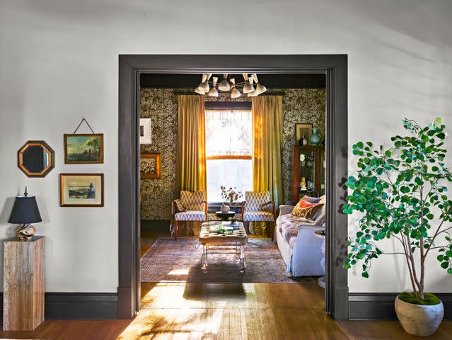
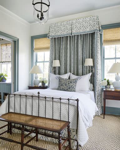
Farrow & Ball Inchyra Blue, No. 289

Hector Manuel Sanchez
In lieu of a grand chandelier, the designer chose a warm, antique- style lantern from Visual Comfort & Co.For naturally light-filled spaces, use darker paint to create contrast. Here, designer Catherine Branstetter experimented fully with color on the walls and trim, selecting Farrow & Ball’s Inchyra Blue (No. 289) for a jewel box effect. “I like having the punch of dark color in there against a lot of the house that’s lighter.” Used in abundance, the rich tone makes a statement, but a little goes a long way as well when just painting trim.
Benjamin Moore Acadia White (OC-38)
Laurey W. Glenn
If you're seeking a less stark white, try a creamy shade like Benjamin Moore's Acadia White (OC-38) which is also known as Ivory White. This soft, off-white hue has just a hint of whipped butter, but still provides plenty of contrast for your light-colored walls. This living room doubled down on the warm white.
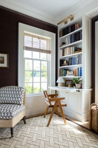
Farrow & Ball Manor House Gray, No. 265

James Ransom
Even in small spaces, paying extra attention to the details adds character. Use contrasting colors to bring hardworking spaces to life. A coat of Farrow & Ball’s Manor House Gray (No. 265) lends spaces warmth without making the room feel dark. Try the shade in semi-gloss.
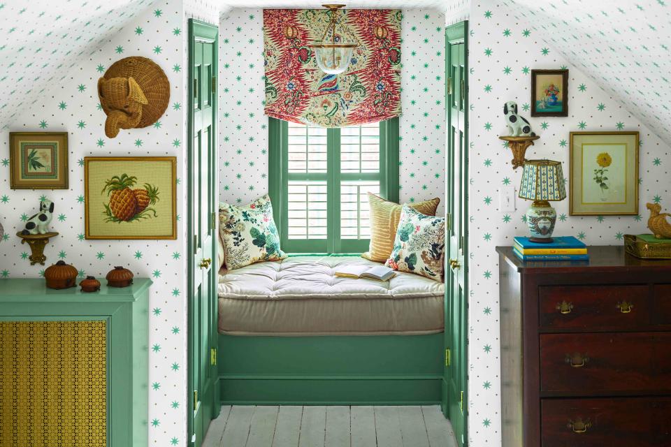
Benjamin Moore Clearspring Green (HC-128)
James Ransom; Styling: Alya Hameedi
This vibrant green is sure to add a playful feel to any space, like this Mary Poppins-inspired playroom. While Benjamin Moore’s Clearspring Green (HC-128) is already a bold choice, use the leafy color with a semigloss finish on your trim for extra punchiness.
Related: This 1930s Virginia Home Proves That Vintage Finds Always Add Character
Sherwin-Williams Naturel, SW 7542
Reverse the usual approach and select a beige paint for your window sashes, creating an interesting contrast with the rest of the trim. The sandstone hue of Sherwin-Williams' Naturel (SW 7542) on these sashes has the effect of brightening the ivory walls. The paint colors are echoed on the flooring.
Sherwin-Williams Fame Orange, SW 6346
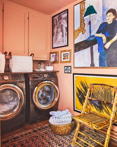
Looking to bring energy to small spaces? Choose a hue that almost jumps off the walls. The laundry room in this Florence, Alabama, cabin is extra lively thanks to Sherwin-Williams' Fame Orange (SW 6346) used floor-to-ceiling; however, we love using the peachy-orange shade as an accent color on trim only.
Related: This Alabama Couple Gave Their 1,400-Square-Foot Cabin A Second Act
Benjamin Moore Chantilly Lace (OC-65)

Described as a go-to white paint, Benjamin Moore's Chantilly Lace (OC-65) offers an elegant spin to any room by representing its silky namesake. This shade complements variations of white and gray tones or provides a simple backdrop for other explosions of color.
Sherwin-Williams Momentum, SW 9530
Really bring the outdoors in with Sherwin-Williams' Momentum (SW 9530) and don't stop with just the trim, extend the earthy green to window frames to draw attention to the scenery beyond the room.
Sherwin-Williams Portsmouth, SW 9644
Laurey W. Glenn; Stylist: Matthew Gleason
This blue-gray is the just-right neutral that still provides a subtle layer of interest. From creamy white walls to punchy wallpaper, a pop of color from Sherwin-Williams' Portsmouth (SW 9644) is sure to complete any room whether it's a hardworking or elegant space.
Sherwin-Williams Pure White, SW 7005
"It's important not to paint your house with a confusing riot of colors," says well-known designer Bunny Williams. "I like to use a lot of soft, warm beiges to keep rooms coherent while giving them character." In our 2015 Idea House, she painted the trim with Sherwin-Williams' Pure White (SW 7005) to offset walls with peach undertones.
Related: 2015 Idea House: A Spectacular Charlottesville Farmhouse
Sherwin-Williams Leaflet, SW 9674
Hardworking areas can still be beautiful and pack a punch with the right color palette. A bright, yet earthy green like Sherwin-Williams' Leaflet (SW 9674) is just the ticket. This multi-use space sees a lot of action and is not lacking design thanks to playful trim that shines against the Lake August Nasturtium in Bigleaf wallpaper.
Benjamin Moore Simply White (OC-117)
With touch of warmth, Benjamin Moore's Simply White (OC-117) can easily be used on trim throughout a home. The classic shade creates a cohesive feel between rooms while wall space is used to bring in more personality.
Sherwin-Williams Silver Lake, SW 9633
Frame the connection to the outdoors with a sky blue for a fun and natural conversation between the indoors and out. Sherwin-Williams' Silver Lake (SW 9633) emphasizes the scenery though the windows while Cotton (SW 9581) helps the blue pop without it becoming too overpowering.
Related: 2021 Idea House: Our Picturesque Kentucky Home
Sherwin-Williams Blustery Sky, SW 9140
Pull off a sophisticated yet energizing monochromatic look with Sherwin-Williams' Blustery Sky (SW-9140) on the trim, then paint the walls a lighter blue, like Sherwin-Williams' Niebla Azul (SW-9137) as seen here.
Farrow & Ball New White, No. 59
Laurey W. Glenn
When former Editor-in-Chief Lindsay Bierman redecorated his home, he chose to paint both walls and trim in the primary bedroom in a creamy beige. Farrow & Ball's New White (No. 59) provided the perfect canvas for his sketches and earth-toned linens.
Sherwin–Williams Ripe Olive, SW 6209
Laurey W. Glenn
Bring a moody, yet energetic feel to any room with a dark green shade. In this open-concept dining room, vertical siding and trim painted Sherwin–Williams’ Ripe Olive (SW 6209) adds a unique look.
Sherwin-Williams Sleepy Owlet, SW 9513
Give trim an upgrade without pushing color too much thanks to Sherwin-Williams' Sleepy Owlet (SW 9513). The sandy brown will especially warm up small spaces, like this powder room, and provide neutral balance for an array of color palettes.
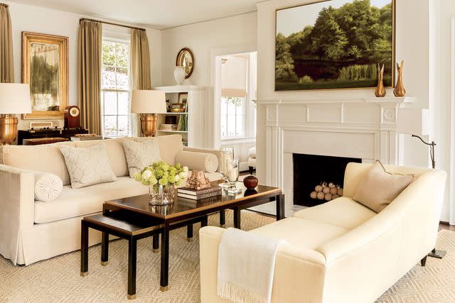
Benjamin Moore White Dove (OC-17)
Keep the paint selections muted and let color, pattern, and texture add personality to a space in other ways. Benjamin Moore's White Dove (OC-17) is the just-right crisp and clean white to frame warm tinted walls, like the burlap wallpaper from Schumacher in this formal living room.
Sherwin-Williams Celestial, SW 6808
Use a pop of color to bring traditionally dark and small spaces to life. With a coat of Sherwin-Williams' Celestial (SW-6808) on the trim, any room will easily become an inviting hangout like this attic space where it's paired with a geometric blue wallpaper.
Sherwin-Williams Koi Pond, SW 7727
This soft green shade strikes a balance between light and dark green which makes it great for a variety of uses from brightening a space to adding depth. In this primary bedroom, designer Betsy Mosby brought the garden indoors with the perfect pairing—trim painted Sherwin-Williams' Koi Pond (SW-7727) and Sanderson Fruit Aviary wallpaper.
Sherwin-Williams Jasper Stone, SW 9133
We can never get enough of Sherwin-Williams' Alabaster (SW 7008), which just might be the coziest white you'll find, but it's especially dreamy when paired with Sherwin-Williams' Jasper Stone (SW 9133). The blue-green trim lends the characteristics of a neutral with a higher contrast.
Sherwin-Williams Urbane Bronze, SW 7048
Get the trending look of dark window trim without a startlingly stark contrast. Try a softer hue like Sherwin-Williams' Urbane Bronze (SW 7048) as seen here. The gray-gold tone complements the beige walls and 100-year-old wood floors in this Bald Head Island home.
Related: 2017 Idea House: Our Breezy Coastal Beach Home
Sherwin-Williams Quietude, SW 6212
While this vibrant floral blue wallcovering is anything but quiet, it showcases how Sherwin-Williams' Quietude (SW 6212) can compliment various shades of blue or sing on its own. For a less formal affair, pair the cheerful trim with a more neutral wall.
For more Southern Living news, make sure to sign up for our newsletter!
Read the original article on Southern Living.
Solve the daily Crossword