Iconic Gabriel Medina Olympic Photo: An Homage to When Surfboard Shapers' Logos Ruled
Jerome Brouillet /AFP via Getty Images
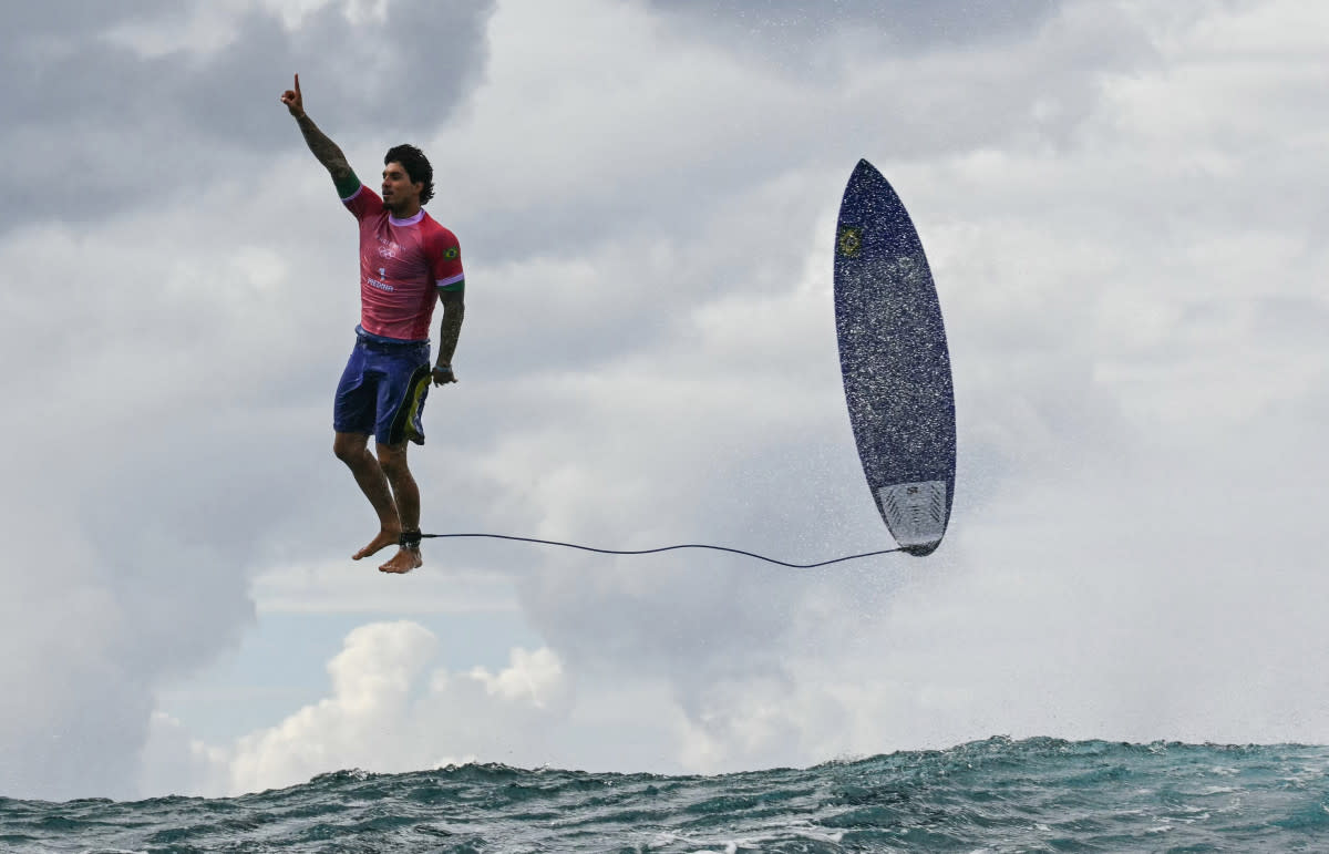
It’s quickly become one of the most iconic surfing—and Olympic—photos of recent times. Jerome Brouillet captured Gabriel Medina suspended, God-like, on an invisible podium bolt upright, three feet above the water, a finger raised in glory. The Guardian described it as "an airborne celebration so well poised it looked too good to be true.”
Mirroring Medina, a leash-length behind, is his surfboard, tail down, nose-high. Surfers will undoubtedly know this could have only been taken at the Olympics. All you can make out on the board is the yellow and gold of the Brazilian flag and the C of the Cabianca Surfboards logo. That's because the Olympics ban all sponsorship logos on athletes, apart from equipment manufacturers.
Board Shapers Finally Get Their Due
“It’s about time us shapers get a little bit of credit,” laughed Johhny Cabianca, who made the surfboard. “You usually need a magnifying glass to spot our logo on Gabe’s boards.” Cabianca shaped a 4-year-old Gabriel his first board in their hometown of Maresias, Brazil.
For the last 13 years, he has supplied Medina’s quiver for each CT event in a rare handshake arrangement that has no contracts or endorsements attached to their relationship. Based in the Basque Country, no one could begrudge the likeable shaper having his logo plastered all over the world.
“It’s about time us shapers get a little bit of credit.”
The same could be said for all the shapers whose boards are being ridden in Tahiti. The role of the surfboard and the shaper in an athlete’s success is absolutely pivotal. And for the first chunk of professional surfing history, that was reflected by the logo placement. Shapers placed their logos on the surfboard’s prime real estate at the nose, where they were most likely to figure prominently in photos and videos.

Nev Hyman
The Golden Era of Shapers' Logos
The 1980s was probably the high water mark when the shapers' logo was king. The cursive A of the Aloha logo took up half of Damien Hardman's surfboard (the rest was deck grip). The huge Rusty R with a dot was synonymous with Occy’s incendiary surfing at that time. The Channel Islands Hex Logo fitted snuggly into the top of Tom Curren’s boards as he went back-to-back in 1986 and 1987. Nev Hyman, who we featured recently, had neon-bright logos blaring from the top of a huge stable of riders surfboards, including Occy. Martin Potter’s Town and Country’s Yin and Yang-inspired circle was the first thing you saw as Pottz soared up the lip.
The Rise of Gotcha
Yet, the change came pretty quickly. By 1989, when Pottz moved to Glen Minami’s new Blue Hawaii surfboard label, Gotcha had taken the coveted real estate on the nose of his board. Then the biggest surf brand in the world, they were paying Pottz the biggest contract seen in professional surfing as he stormed to a World Title. Money talks and logos walk.
The shapers couldn’t keep up with the commercial clout of the brands as the surfing boom went into overdrive in 1990. Kelly Slater was right on the cusp of that change. In his seminal film Kelly Slater in Black and White, filmed in 1989 and released in 1990, all of his surfing is done with the Channel Island Logo sitting at the nose of his Al Merrick squaretail. By the time he scored the September 1991 Yearbook SURFER cover, the Quiksilver logo had migrated to the nose as part of the six-figure contract he had signed. It would stay there for the next 25 years until his own brand, Outerknown, took over in 2014.
By the CT event in Tahiti this year, Cabianca joked that half his job was organizing the sticker placement for Gabe’s boards. His biggest payer, Rip Curl, took the nose, and Johnny's was one of 10 other logos placed along the length and breadth of the surfboard.
The Olympics Put Shapers Back in the Spotlight
The irony is that it has taken the Olympics, one of the most corporatized sporting events in history (the last four-year cycle generated US$7.6 billion in revenue for the IOC), to put the shapers back in the spotlight.
“The photo showed the perfect harmony between a surfer, his board and a near-perfect wave," concluded Cabianca. “For the world to see it was a real joy.”
Related: Surfing Is the Most Dangerous Olympic Sport; Day Three Proved It
