Meghan Markle’s handwritten logo is a regal delight

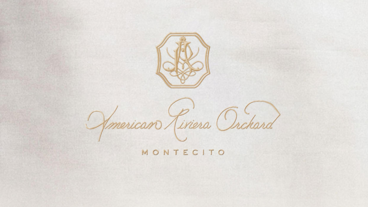
Last month Meghan Markle launched her classy new brand American Riviera Orchard and fans were enamoured by the stylish design of the logo. It turns out that Meghan's stunning design is even more of a treat than we expected, as the ornate calligraphy was revealed to be the duchess' own handiwork.
Script fonts aren't easy to master but Meghan was well equipped. Before her acting career, she worked at the Paper Source store in Beverly Hills teaching calligraphy, book-binding and gift-wrapping, which refined her elegant penmanship. It's a wonderful addition to the brand's bespoke classy appeal, giving us some royally beautiful logo design inspiration.

The American Riviera Orchard logo is a beautiful example of minimalist design, embracing neutral tones and accents of gold to give it a refined luxurious look. Alongside the custom calligraphy is a stylish crest that embodies the elevated classiness of the brand, combining calligraphic forms inside a strong yet timeless frame that gives the brand an elegant, regal feel.
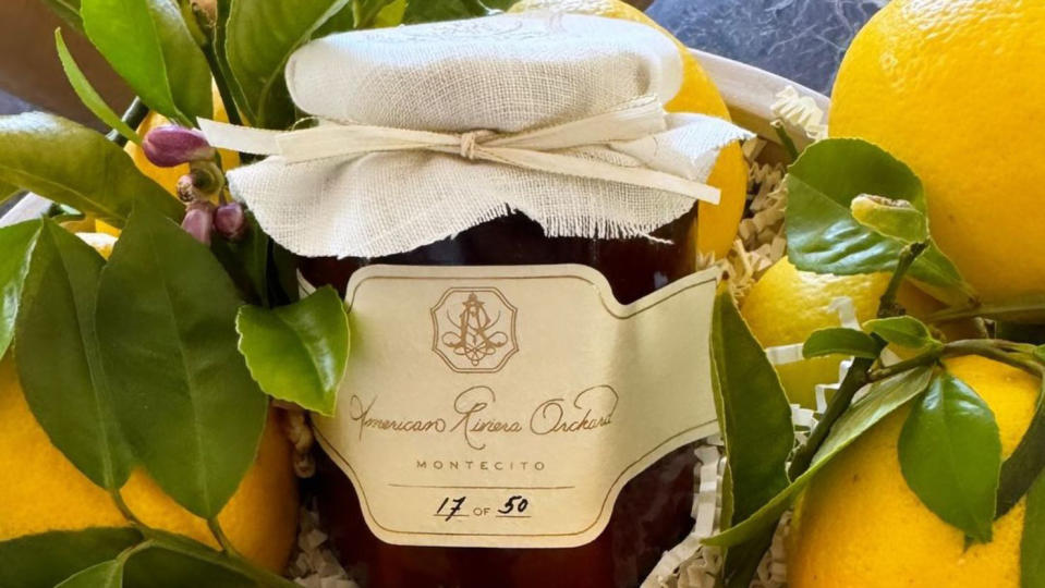
American Riviera Orchard has remained somewhat mysterious, with only one debut product being announced thus far – a bespoke strawberry jam. The lifestyle brand seemingly aligns with Meghan's upcoming Netflix series focusing on “the joys of cooking, gardening, entertaining and friendship,” according to Deadline.
For more design typographical inspiration check out our collection of the best free fonts. If you're after more stunning design take a look at the New Yorker's gorgeous optical illusion cover that's a spring delight.