6 features that iOS 18 stole from Android
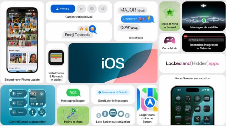
Apple took to the stage in an all-singing, all-dancing presentation at WWDC 2024 to unveil iOS 18, the latest software upgrade for the iPhone. Apple Intelligence may be the headline act that’s stolen all the coverage, but iOS 18 will also introduce a boatload of smaller changes that can’t simply be forgotten. Once you upgrade to iOS 18, you’ll get more customization options, icon theming, a game mode, and more.
Really, Apple fans have never had it so good. But if that seems familiar to some of you, well, it’s because iOS is becoming more and more like Android. To Android fans like me, the irony is so, so sweet. Apple fans, enjoy your new and awesome features that have been very obviously cribbed from Android.
All right, I’ll put a bit of the snark aside to say that it’s awesome that Apple fans are getting some of these features, as some of them are very helpful indeed. Others are … er, well, I’m not quite sure why they’re there. Here are six features iOS stole from Android and the reasons you should care about them.
Placing apps anywhere on the home screen
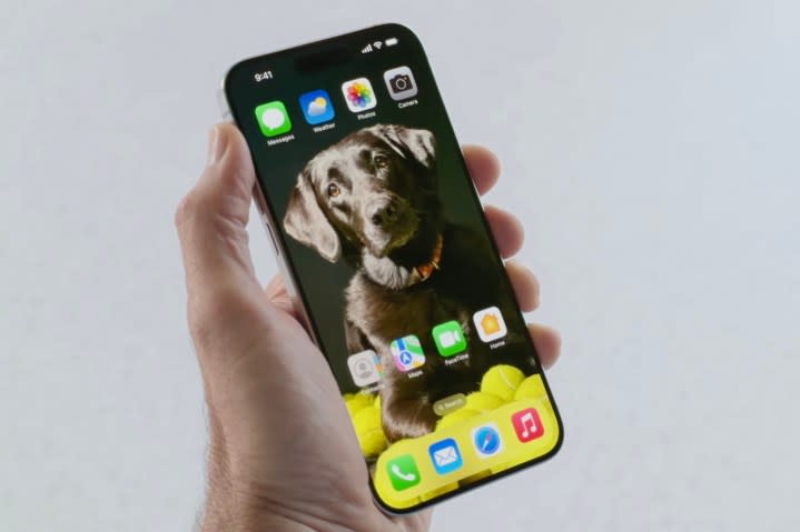
Apple has been on a journey in the last few years, and the central message at the core of that journey is seemingly, “Huh, it turns out Google was right.” The last few iOS versions have done nothing but admit Android’s approach of offering control to the user is the correct one. A lot of these have centered around the home page and have included the implementation of widgets (which have taken off) and an App Library (which everyone has forgotten about).
You might think Apple is running out of ideas, and you would, um, be absolutely correct, actually. Next on the list is moving apps around on your home screen.
Yes, once you get iOS 18 you’ll be able to do such incredible feats as moving an app icon. If you’re an Apple fan, you know how revolutionary and enormous this is — no more using weird workarounds and “blank space” to fool iOS into letting you put whatever you want wherever you want.
OK, as an Android user, I can’t really contemplate not having this level of control already, but I’m glad iOS users are finally getting it. Even if it took 18 versions for Apple to realize Android was right.
Finally, you can ruin your iPhone’s carefully created color design
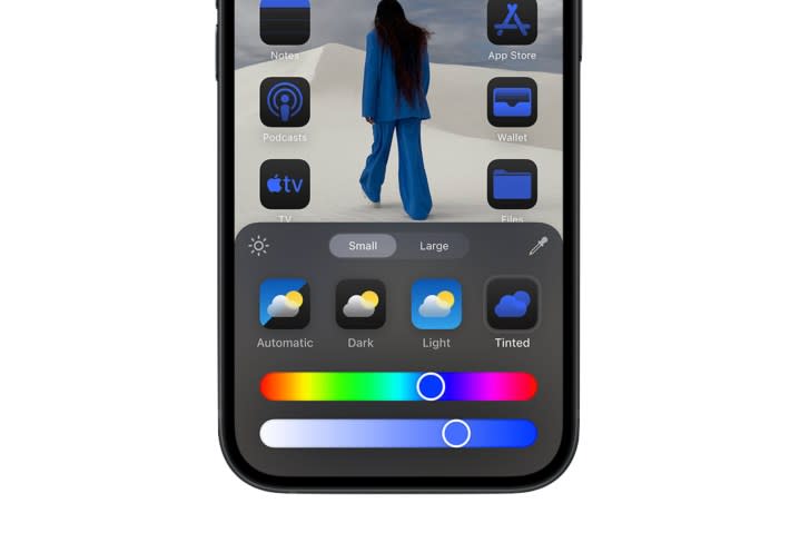
Apple’s other big home screen announcement is allowing people to ruin iOS’ carefully curated style. iPhone owners can now add a discordant color scheme or ugly icon pack to every app on their home screen, destroying Apple’s expertly created color scheme.
Customization now extends to changing the color and tint of your app icons. You can match black-and-white icons to a similarly colored background or turn everything a garish shade of neon pink. Yes, if you want to ruin your iPhone’s style, Apple will now let you.
But it’s also worth pointing out something else about this addition: It’s really boring. Android has had this for years, and it’s clear Apple has shamelessly nicked it — but ask an Android owner about it and they’ll either not know about it, or they’ll shrug. They’ll shrug because they tried them out years ago, got bored, and changed them back.
This is one I can speak from experience on: I’ve had these features for years, and I simply don’t use them. Will Apple’s implementation be the same? I’m willing to bet so, but have fun with it while it’s still new and exciting.
Locked and hidden apps
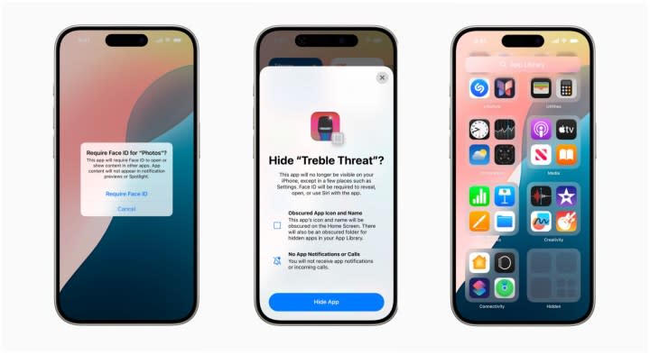
Moving icons and turning them into funky colors aren’t the only changes coming to apps. Unlike the previous two, this one is actually useful: iOS 18 will introduce the ability to lock and hide your apps.
It’s another Android feature — but it wasn’t originally a stock Android feature, as we have the oft-maligned manufacturer skin to thank for this feature. Though some of its Android interfaces were terrible, Samsung introduced a number of useful features long before either Google or Apple, and that includes the ability to hide apps. Admittedly, it was primarily used to hide manufacturer bloatware and other junk apps that couldn’t be uninstalled, so it was hardly a point of pride for a long time, but it can also be used to hide away banking apps or other apps with sensitive data. Honestly, given the emphasis Apple has put on privacy the last few years, it’s surprising it’s taken this long to add this feature.
But better late than never, and if you can’t beat them, steal their stuff. Once iOS 18 rolls out, you’ll be able to lock apps with sensitive data and hide those apps you’d rather people didn’t know you had.
You’ll want to lock apps that contain sensitive data — banking and budgeting apps are prime examples. You’ll likely want to be even more selective when it comes to hiding apps, though, as this means you’ll find it harder to access them. Good apps to hide are those that add utility to your device but don’t need to be opened, ever, like keyboard apps. Or apps you can’t remove but don’t need.
Customizing the Control Center
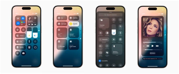
I’ve used iOS and enjoyed the cross-device tricks Apple packs into it, but how on Earth have any of you managed without some of the most basic quality-of-life features? Do you mean to tell me you’ve had to dive into your Settings app every single time you’ve needed to move an icon in your Control Center? This is basic stuff, and it’s bizarre that it took Apple 18 iterations to realize it forgot about it.
This isn’t a blockbuster feature by any means, but it is very helpful. I’ve lost count of the number of times I’ve rearranged my quick settings to push certain features to the top. Moving the cell data toggle to the top because I’m running out on my contract or keeping the Do not disturb icon closer to the top so I can quickly turn it on for a driving lesson is double-underline-level useful. This coming to iOS is big, even if it’s not a headline feature.
Choose different lock screen shortcuts
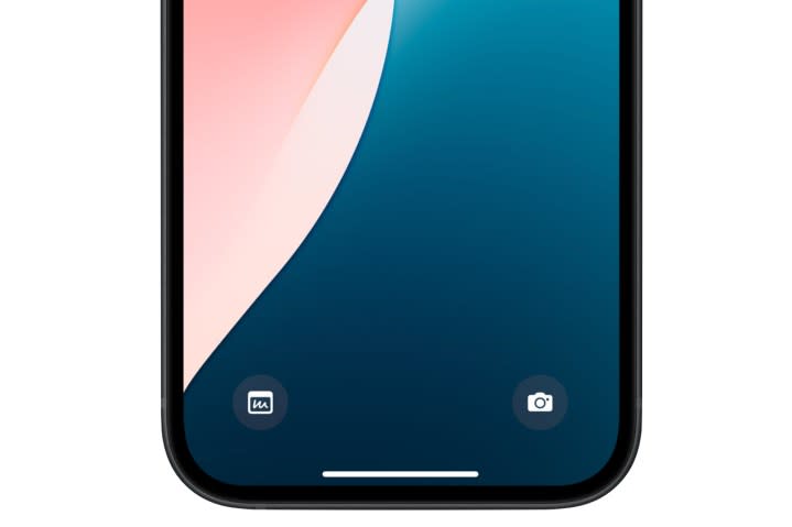
Customization was never an iOS strong point, but that previous cast iron is no longer true. Being able to change elements of your UI is now so embedded into Apple’s mobile software that from iOS 18 onward, you can change the app shortcuts on your lock screen.
If you’re not familiar with this feature, it means pressing and holding either shortcut opens them. By default, those are the camera and the flashlight — but with iOS 18, you’ll be able to choose different apps to fill these spaces.
In practice, this just means your phone opens a different app by accident when you’re trying to unlock your phone. But hey, opening Instagram instead of turning on your flashlight again is definitely an improvement. Honestly, this wouldn’t be on my shopping list of features to nick from Android, but more choice is generally always good.
A dedicated game mode
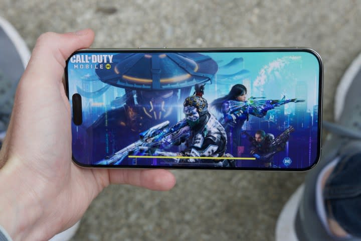
MacOS may not be for games, but iOS certainly is. It’s galling to admit this as an Android user, but yeah, the iPhone really does get all the best games, and it’s pretty darn good at running them. So, it’s a bit of a surprise it’s taken Apple this long to figure out what a game mode is when Android phones have been using one for years.
You can make the argument that iPhones didn’t need them while lower-powered Android phones do. And there’s some merit in that argument on the budget end of the market, but if you believe midrange and flagship Android phones don’t have enough power, then I have a bridge to sell you. Game modes are always helpful, no matter the power at your device’s disposal.
But what is a game mode? Simply put, it makes your device focus on the game it’s running. Flick on iOS’ Game Mode, and your iPhone will put your background activities on the back burner and ensure your game is running with as many resources as possible. It also reduces input lag from Bluetooth controllers and AirPods, meaning the game experience is tighter across the board.
Why has it taken so long to get to iOS? Once again, it seems a little bit like Apple is out of ideas and is just throwing stuff into iOS 18 to fill up a quota — but it’s a welcome addition regardless.
