I love the Google Pixel 8 Pro — except for one thing
I really like the Google Pixel 8 Pro, but it does not feel like a $1,000 smartphone. It makes me miss the Pixel 7 Pro and pine to return to the unbelievably high-quality Samsung Galaxy S24 Ultra that I left behind little more than a week ago.
However, for now, I’m staying with Google’s latest flagship. And there’s one simple reason why.
What should a $1,000 phone feel like?
The Pixel 7 Pro was controversial, as some owners experienced crippling software problems that ruined the phone. But I managed to avoid anything like that, and it was almost completely reliable every time I used it. It meant I could enjoy the super camera, the clean and simple software, and the wonderful design. It still looks excellent, and my model’s white and polished steel look really stands out. It cost $900 when it was released.
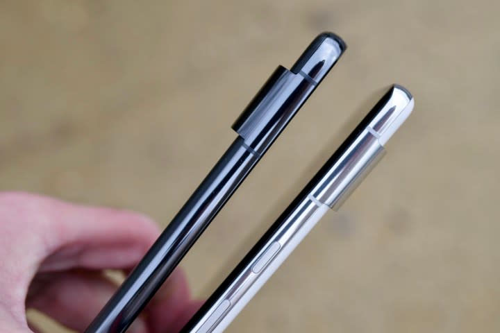
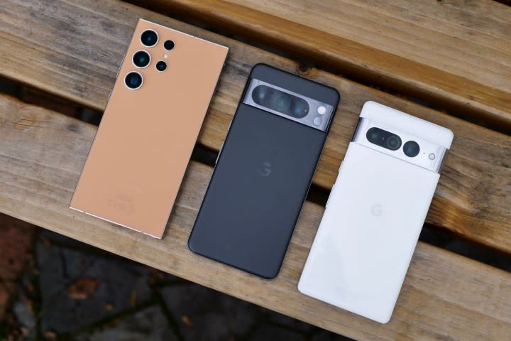
But when you pick it up along with the Pixel 8 Pro, which costs $1,000, there is a disappointing difference in in-hand feel, and a lot of this is down to the change from a curved screen to a flat screen. The Pixel 7 Pro has a gentle curve down the sides, with the glass meeting the frame in a way that comfortably suits how we hold a phone with one hand. It minimizes the visual impact of the side bezels, too.
This is not the case with the Pixel 8 Pro, which has a flat screen and no contoured flow between it and the frame. It’s not uncomfortable as such, but it’s not very ergonomic, and the bezels around the screen are there for all to see. Curved screens are as controversial as the Pixel 7 Pro’s reliability, with a clear split between those that love them and those that don’t. I think curved screens are more attractive, more ergonomic, and a more pleasing design choice that works to justify the price of a modern smartphone.
The screen problems don’t stop there
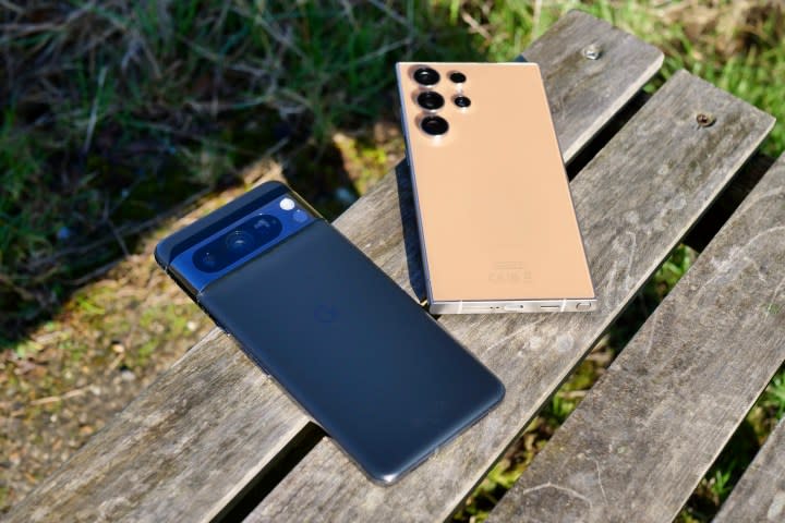
But not all flat screens have to come straight out of 2019 like the Pixel 8 Pro’s, and the evidence is right there in the Samsung Galaxy S24 Ultra. Although technically flat, the screen still flows into the curved titanium frame, which has been designed to feel great in your hand. It’s a completely different and far superior alternative to full curved glass. It’s also representative of the S24 Ultra’s massive $1,300 price.
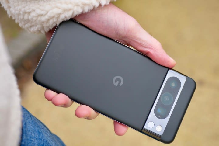
The Pixel 8 Pro’s overall design is still great, and while the camera module has a lot more going on than before, it’s still a fancy-looking device. But the flat screen and the disregard for ergonomics is a backward step and very disappointing on a phone that costs $100 more than its predecessor. Samsung shows that adopting a flat screen doesn’t have to come with that one big drawback of reduced comfort, and it has resulted in a phone that is far more modern than you’d expect.
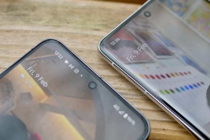
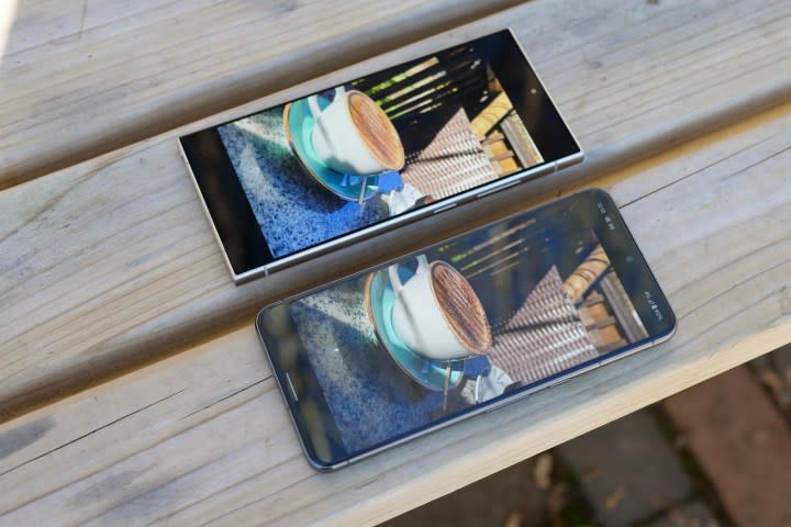
The Pixel’s screen problems don’t end there either, as coming from the big, bright, and reflection-free Galaxy S24 Ultra, the Pixel 8 Pro’s screen isn’t quite as pleasant to use. The S24 Ultra’s Corning Gorilla Armor glass’s anti-reflection properties aren’t marketing nonsense, and it really shows when it’s alongside the Pixel 8 Pro outside.
Brilliant in its simplicity
Yet here I am, with the Pixel 8 Pro still in my hand, despite not being that impressed with the design or the screen, especially because I know I can do better. Why am I “suffering” like this?
Once again, I’ve had no software problems with the Pixel 8 Pro — which seems to be a far more reliable phone in general — and appreciate Android 14’s design and efficiency enhancements. But as I mentioned earlier, there’s a simple reason why the Pixel 8 Pro is staying put, and it’s exactly that: simplicity,
The Galaxy S24 Ultra is fantastic, but it’s also absolutely stuffed with features, tools, and distractions. There’s always something to do and try, and to just use the basic features feels almost like a waste. Between the Galaxy AI tools, the S Pen stylus, and the monstrous power, it can sometimes seem like the smartphone equivalent of buying a fully kitted-out Mac Pro only to write shopping lists in Notes. There’s nothing wrong with that, but it’s undeniably overkill.
I don’t feel like that with the Pixel 8 Pro. It does everything I want without argument, and at a very fast speed, and isn’t filled with other features I rarely use. It’s beautifully simple in the best way possible, as the things it does — software, camera, apps, games, and calls — it does extremely well, and I rarely want more.
The biggest problem of all
I’m enjoying the Pixel 8 Pro, provided I ignore the fact it’s a little uncomfortable to hold, and I am in the process of comparing the camera to the Galaxy S24 Ultra to see which one is better. But regardless of how that test turns out, I can’t get the thought that there is another very similar smartphone out there that would likely satisfy me just as much out of my head, and it reinforces the fact the Pixel 8 Pro costs too much money.
It’s the non-Pro Google Pixel 8, which is appropriately priced at $700 yet still has the same processor, IP68 water resistance, selfie camera, software, and update promise, plus its own brilliant main camera. That’s a significant $300 savings, and while the Pixel 8 Pro is clearly the higher specification device, the Pixel 8 is a better value considering the similarities. When I reviewed the Pixel 8, I wondered how much better the Pixel 8 Pro could be, and now I have the answer. It’s better, but I don’t think it’s $300 better.
The further problem for the Pixel 8 Pro is that I think the Samsung Galaxy S24 Ultra is $300 better than the Pixel 8 Pro, as it’s jam-packed with features and tech the Pixel doesn’t have. It leaves the Pixel 8 Pro somewhere in the middle, competing with the also-excellent Samsung Galaxy S24 Plus.
But on those days and weeks when I just want a truly brilliant, delightfully simple smartphone with a killer camera and software, the Pixel 8 Pro is hard to beat. It’s just $100 more expensive than it really should be.
